Daria Koshkina is a multidisciplinary artist and data visualization researcher. She creates work that moves between scientific inquiry and artistic expression.

Bees, unlike humans, can detect the electromagnetic structure of the sky. Humans have a more limited capacity to sense reality, as our perception can grasp only a small portion of the immense electromagnetic fields of mysterious reality around us. Perhaps this is why humans care deeply about the pursuit of facts and truth, yet use creativity to describe powerful subjective experiences, unique to each of us. In her work, Daria explores this intersection of data and subjective human experience and how both influence culture, using tools at the intersection of data art, visual design and figurative art. Her practice is rooted in extensive experience in art direction, illustration, communications design, and a scientific body of knowledge.

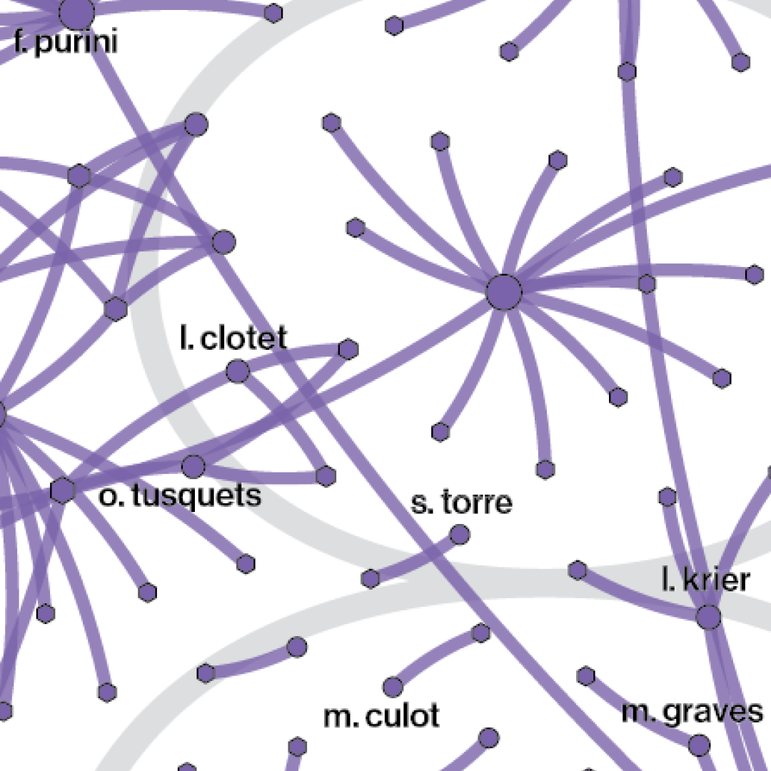
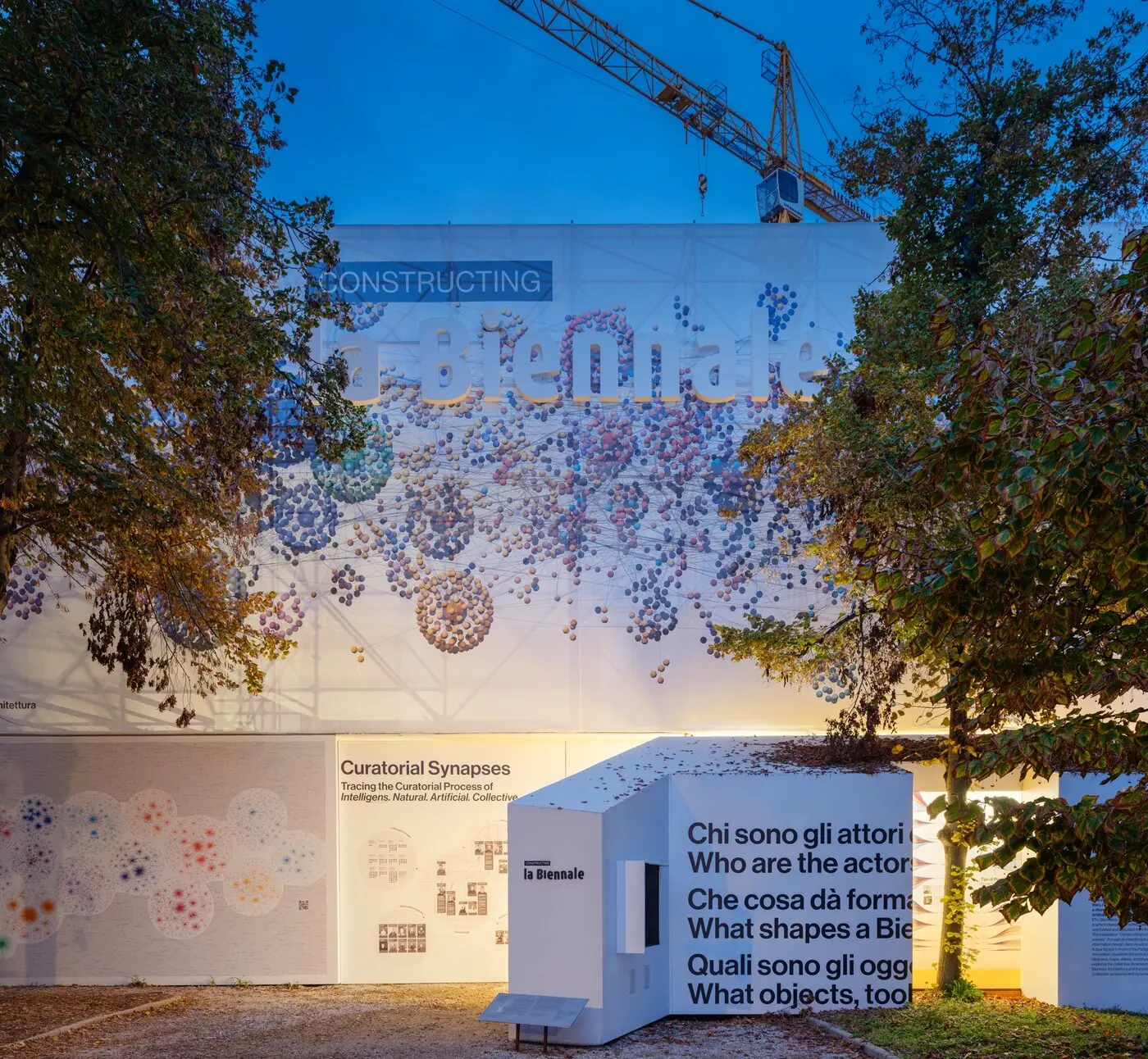
Constructing La Biennale at dusk, Venice: a network of coloured spheres printed across the pavilion facade
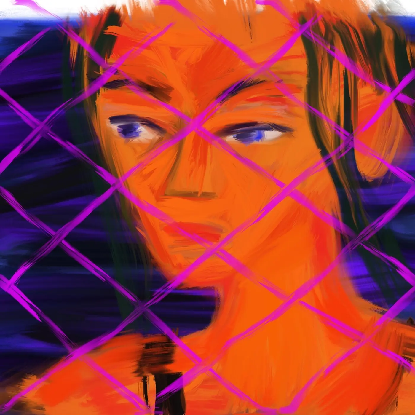
Digital painting of a woman's face in orange, seen through a pink chain-link fence
Bestselling Books network: books on the left linked by curved lines to the subject tag "women" on the right
001

Bestselling Books Project

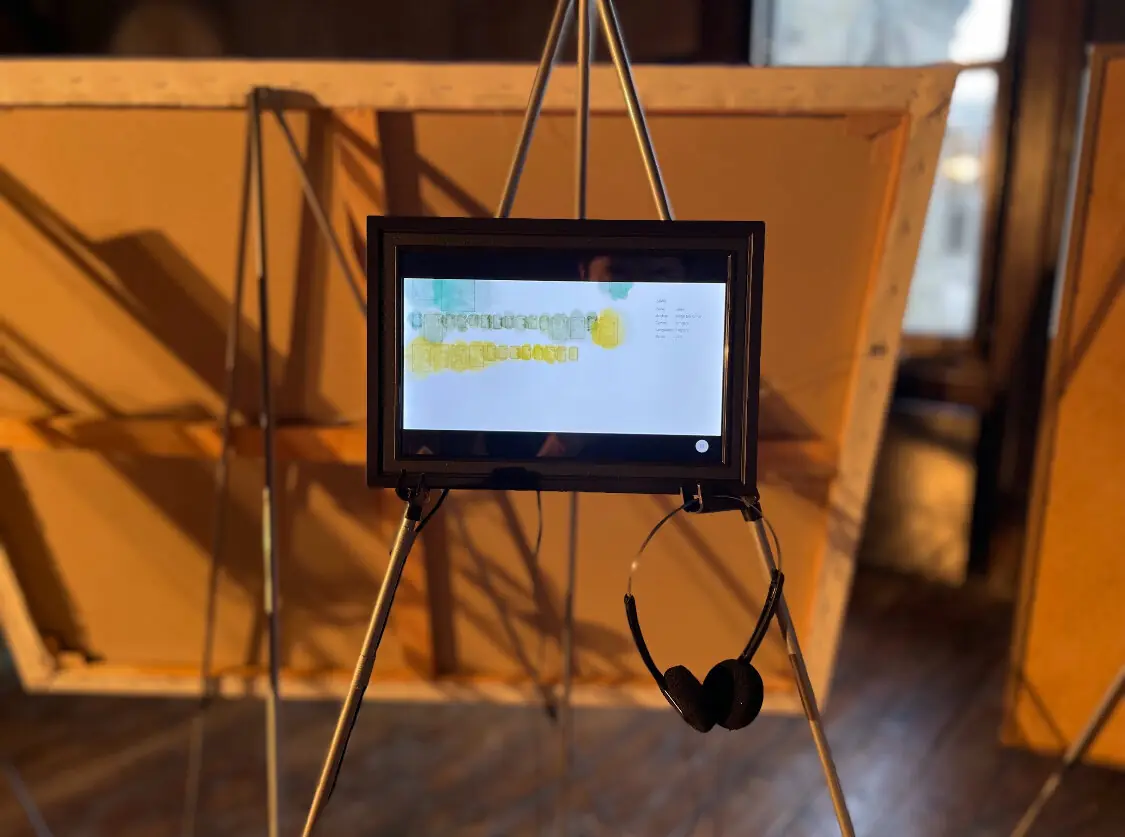
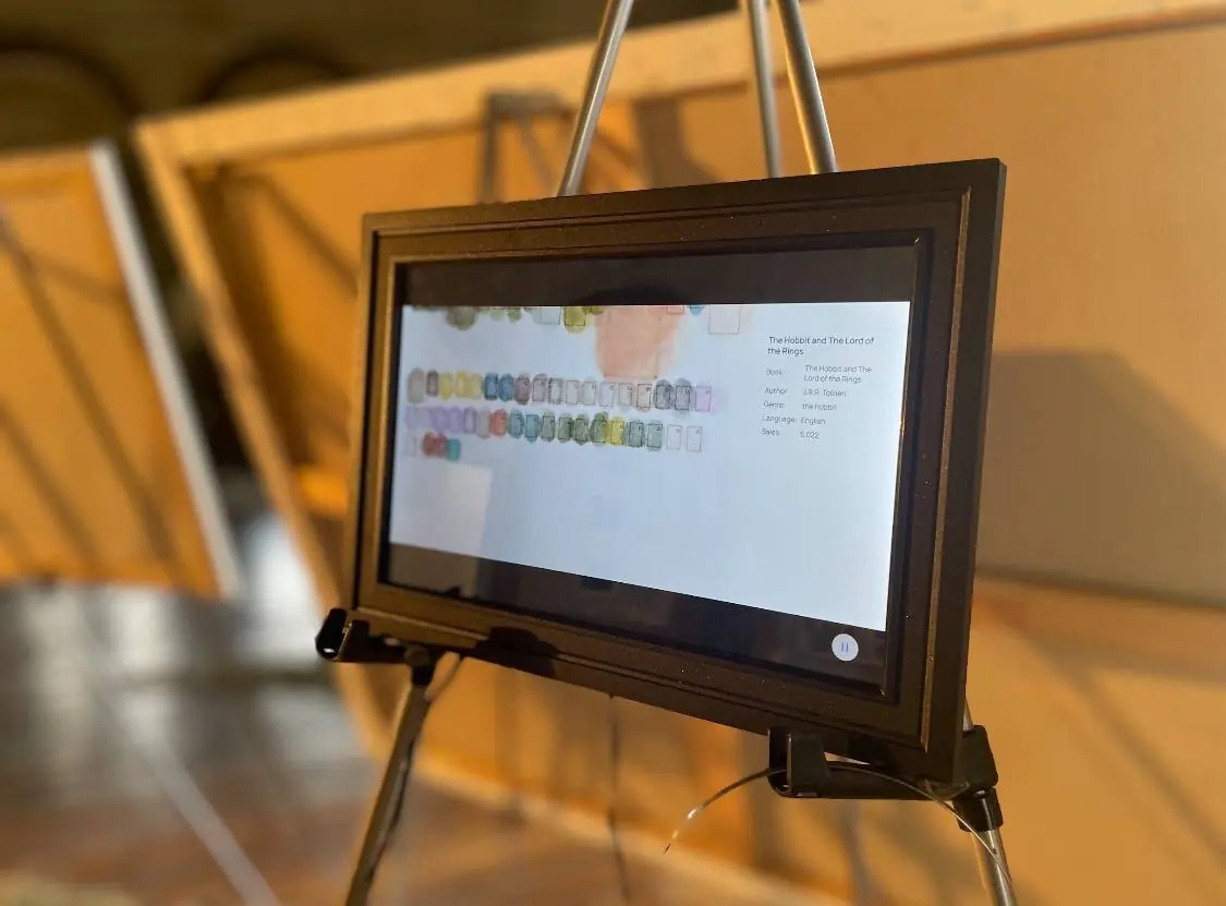
Bestselling Books Project on a framed screen on an easel, with headphones, at London Design Festival
Fig. 001.3
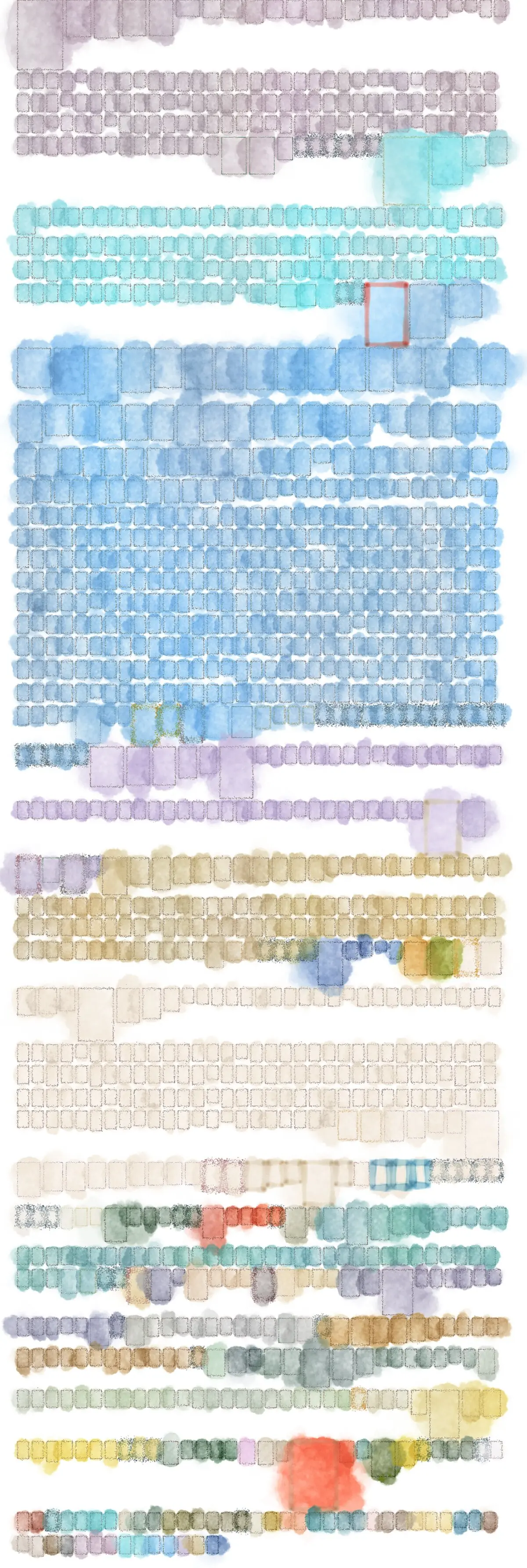
Genre Tag Library: rows of watercolour book shapes grouped by colour, each sized by sales
Fig. 001.4
Medium
Interactive data visualization and video
Materials
Data
Dimensions
Web; video, 1920 × 1080 px
Tools
p5.brush, dataset, LLM (data cleaning and coding)

The Story

The Bestselling Books Project is an artistic data visualization that treats literary genre not as a fixed taxonomy but as a fluid social construct. Taking the Barthesian premise that to read is to struggle to name, the Bestselling Books Project maps the networks of community-generated subject labels that readers actually use to describe bestselling books. By analyzing bestseller books data and user-generated book labels from Open Library's API, the project renders the relationships among the 200 most-used subject tags and the books they cluster, inviting viewers to explore genre boundaries that prove more contested than fixed.

The Bestselling Books Project is organized as an exploratory interface that reveals unexpected connections between genres while preserving how readers actually describe and connect with books. The project’s interface expresses this network from two directions: a Network View, where node size encodes a subject's total connections, and a Genre Tag Library, where each book is sized by sales and brushstroke color and style encode its original language of publication.

The interface was built using JavaScript, p5.js brush and LLM collapsing approximately 80 raw labels to 11 navigable types. Our interactive network maps the relationships between subjects and their most-sold books, filtered to include the top 20 bestsellers per subject. The visualization combines quantitative network analysis with artistic data visualization research to transform complex bibliographic data into an intuitive, exploratory experience. While our dataset draws from open-source data, capturing neither every bestseller ever written nor sales details, this limitation aligns with our observation: literary classification, like any categorization system, is incomplete and ever-evolving. We invite users to explore these connections and contribute your own observations to this ongoing dialogue.
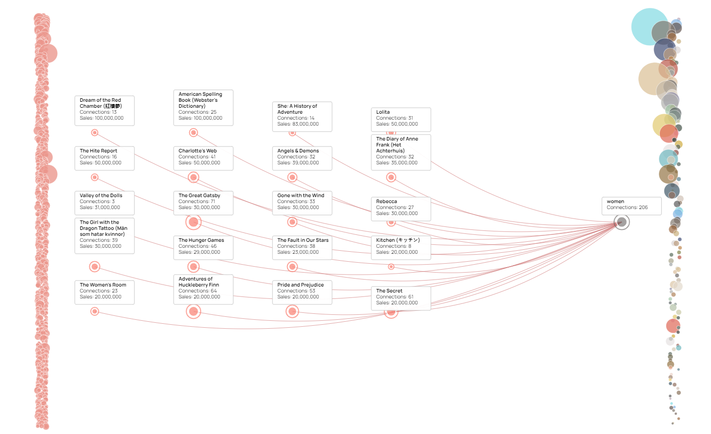
Bestselling Books network: books on the left linked by curved lines to the subject tag "women" on the right
Fig. 001.5
Close-up of the Bestselling Books screen showing The Hobbit and The Lord of the Rings
Fig. 001.6
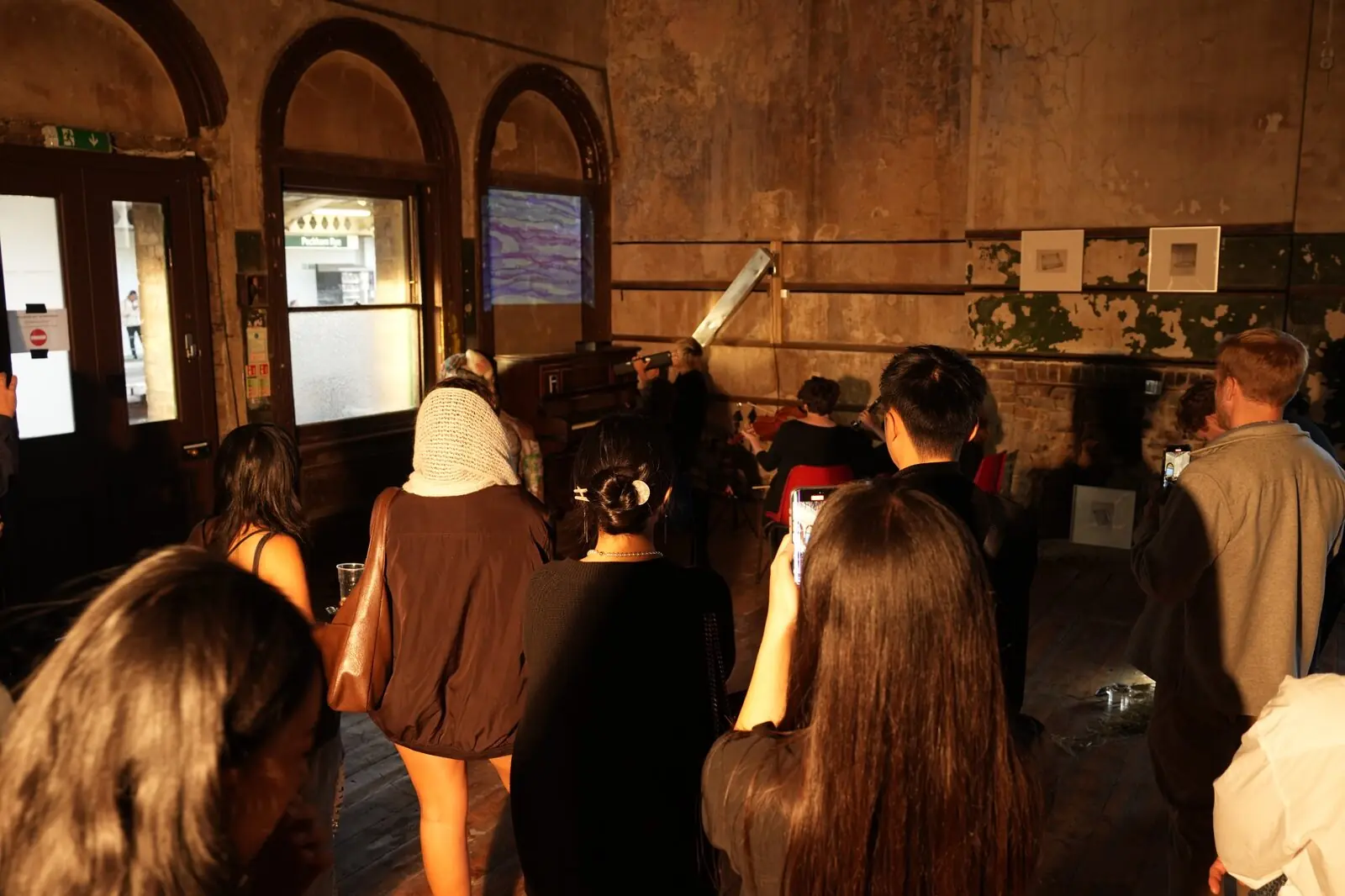
Visitors at the London Design Festival exhibition in a room with arched windows
Fig. 001.7
Credits

Scientific collaborator: Yixuan Liu
Music: Jose Gonzalez
002

A part of Barabasi lab collective

Data Rollers

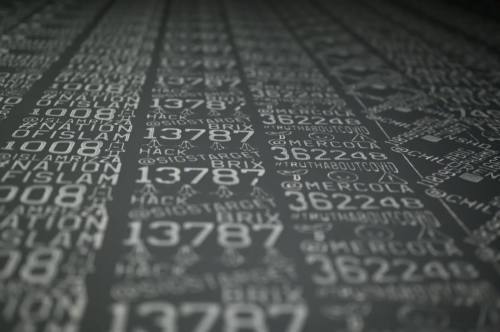
Close-up of grey paper printed by roller with numbers, hashtags and account names
Fig. 002.1
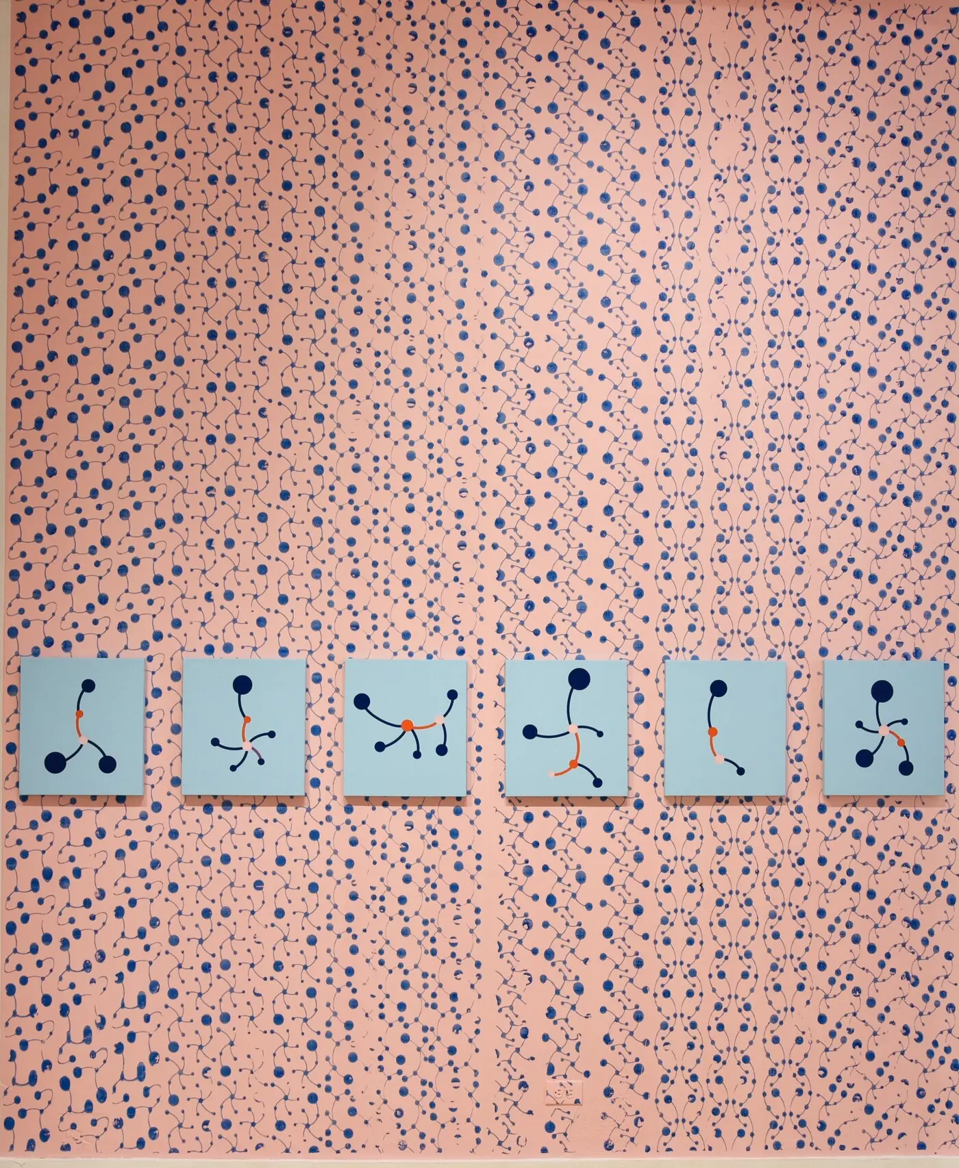
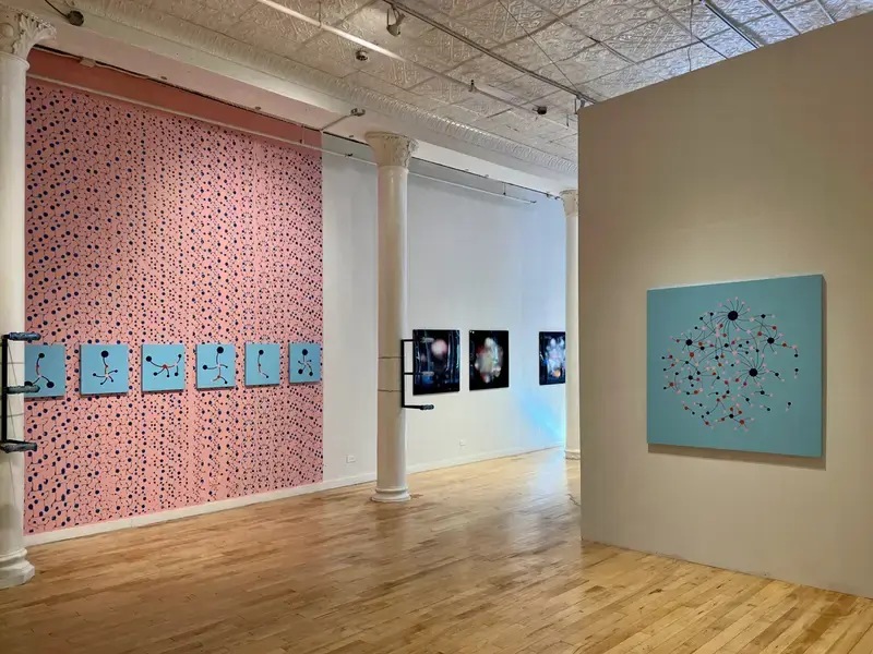
Pink wall printed by roller with blue networks, with six small blue network paintings in a row
Fig. 002.2
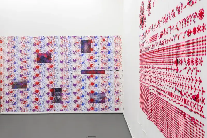
Gallery wall printed with red networks, with blue network paintings in a row
Fig. 002.3
Gallery room with walls printed in red and blue network patterns
Fig. 002.4
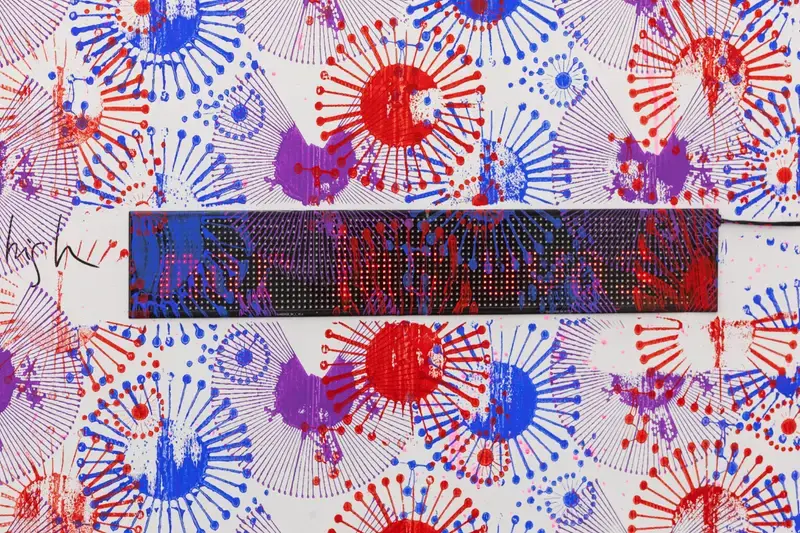
Detail of red and blue network print with a screen across the middle
Fig. 002.5
Medium
Typography-based data art
Materials
PVA, data
Dimensions
Adjustable
Tools
Blender

The Story

I contributed to BarabasiLab projects that re-envisioned the Fake News Observatory at the Network Science Institute at Northeastern University in Boston, MA; Book Bans - PEN America (an organization that tracks book bans and fights censorship in public schools and libraries); and envisioning data representing free, available, bestselling books. I used mediums such as textual compositions to encapsulate data, and transferred them to the 3d printed industrial tools I designed, to create data art paintings as well as interactive websites and static visualizations. Each project had the goal of uncovering and relaying the layers of social context that continue to create our understanding of literary genres; censorship of gender, ethnicity, and LGBTQ+-related books; social networks; and fake news discourse. They displayed clearly the many levels of underlying meaning behind the connections between humans, historical events, social constructs, and ideas that shape our culture.

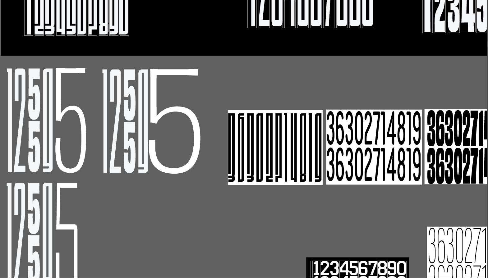
Roller design: columns of tall numerals in black, grey and white
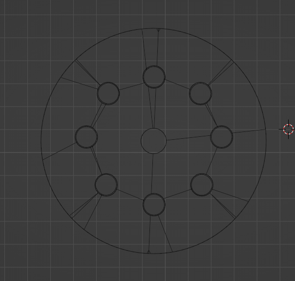
3D model of a roller layout seen from above, a circle of eight points
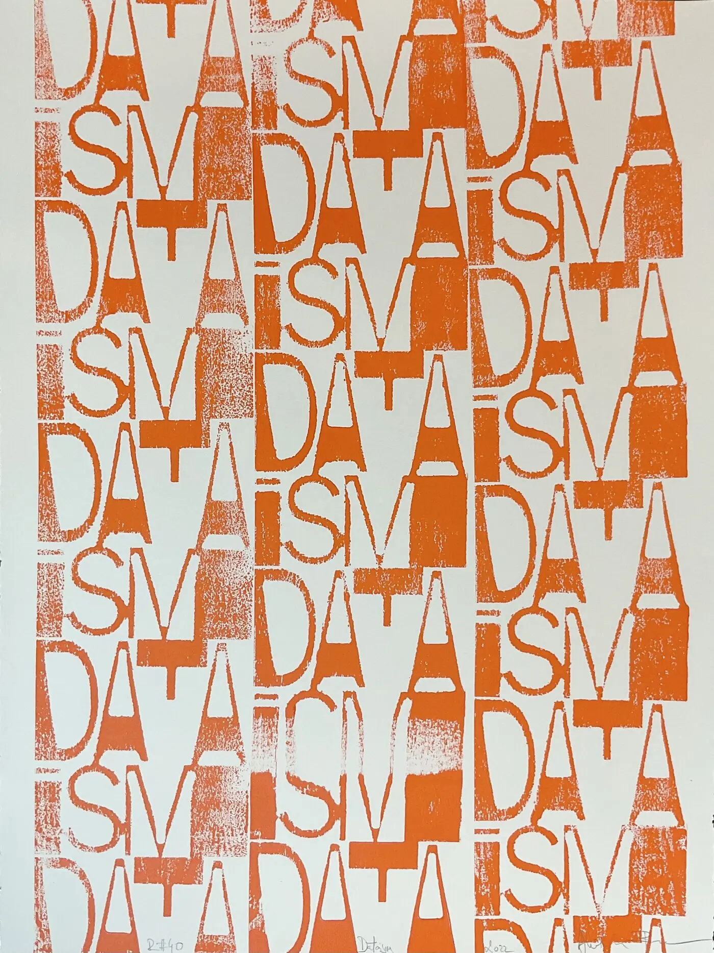
Orange print of the word DATAISM repeated in columns, signed in pencil

Fig. 002.6–002.9 — Data Rollers

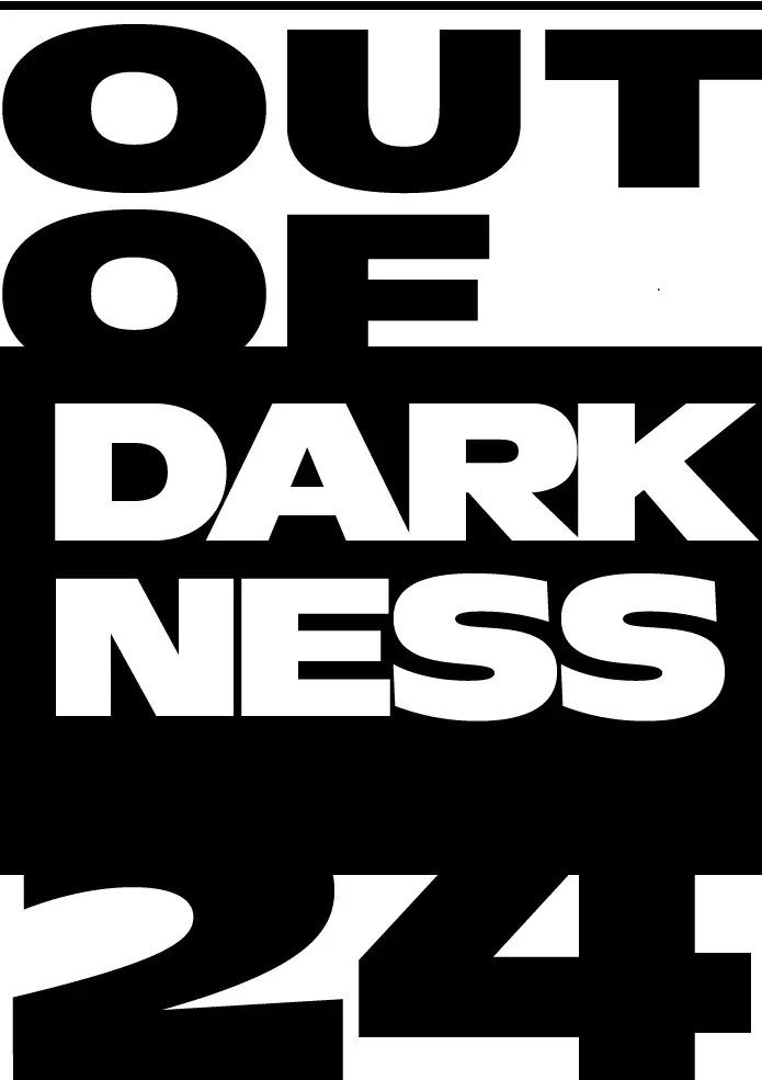
I designed typography-based data visualizations of the top 10 banned books according to PEN America and created 3D rollers that were used to create paintings.

Numbers represent how many times books were banned in the school libraries.

Typographic poster: the banned book title Crank with its number of bans
Typographic poster: The Absolutely True Diary of a Part-Time Indian with its number of bans
Typographic poster: Out of Darkness with its number of bans
Typographic poster: The Bluest Eye with its number of bans
Typographic poster: The Kite Runner with its number of bans
Typographic poster: The Hate U Give with its number of bans
Typographic poster: Me and Earl and the Dying Girl with its number of bans
Typographic poster: Lawn Boy with its number of bans
Typographic poster: Gender Queer: A Memoir with its number of bans

Fig. 002.10–002.18

Credits

Contributors

Roller design: Daria Koshkina
Paintings: Albert-László Barabási

Banned Books

Roller design: Daria Koshkina
Painting: Albert-László Barabási
Studio assistant: Ádám Mányoki
Data collection and analysis: Kishore Vasan
Photography: Daniel Kristofy

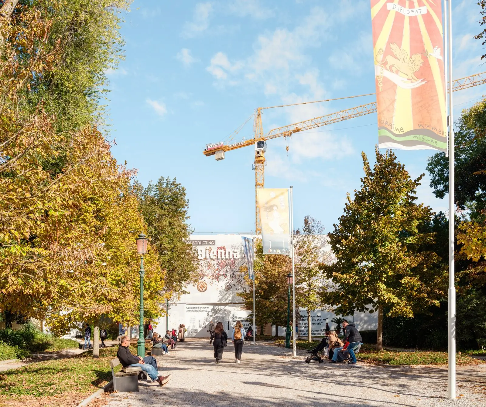
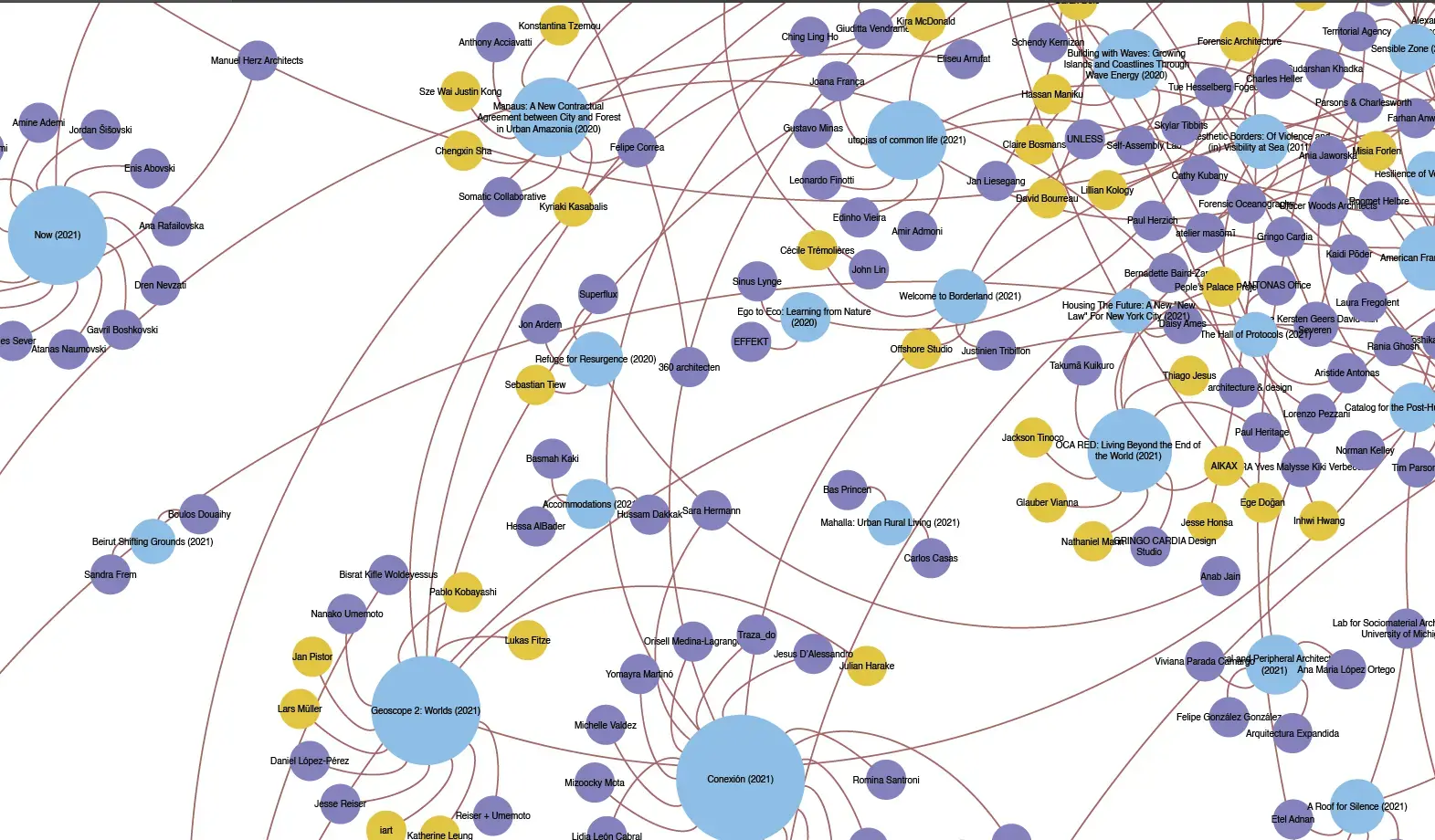
Constructing La Biennale, Venice Architectural Biennale 2025

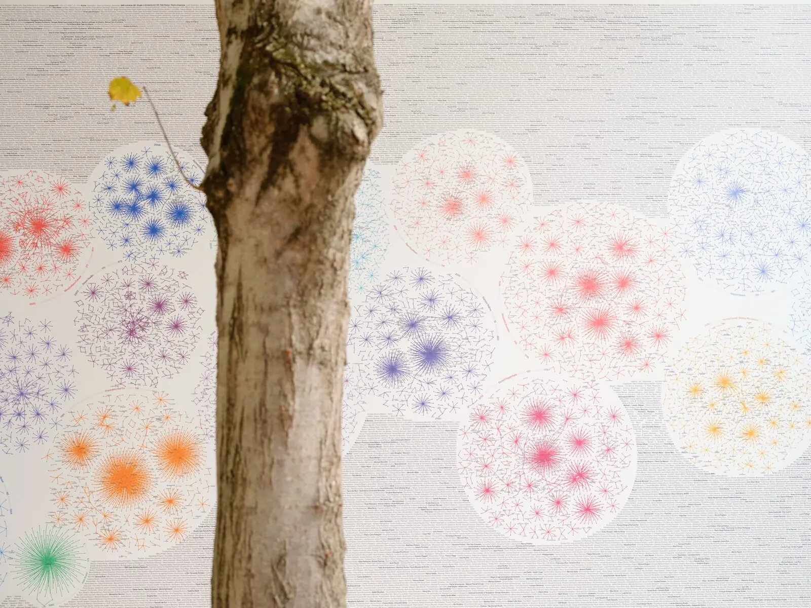
A tree in front of the network wall at the Venice Architecture Biennale
Fig. 002.19
Path in the Giardini, Venice, leading to the Constructing La Biennale pavilion under a crane
Fig. 002.20

Venice. Photo credits: Anna Positano

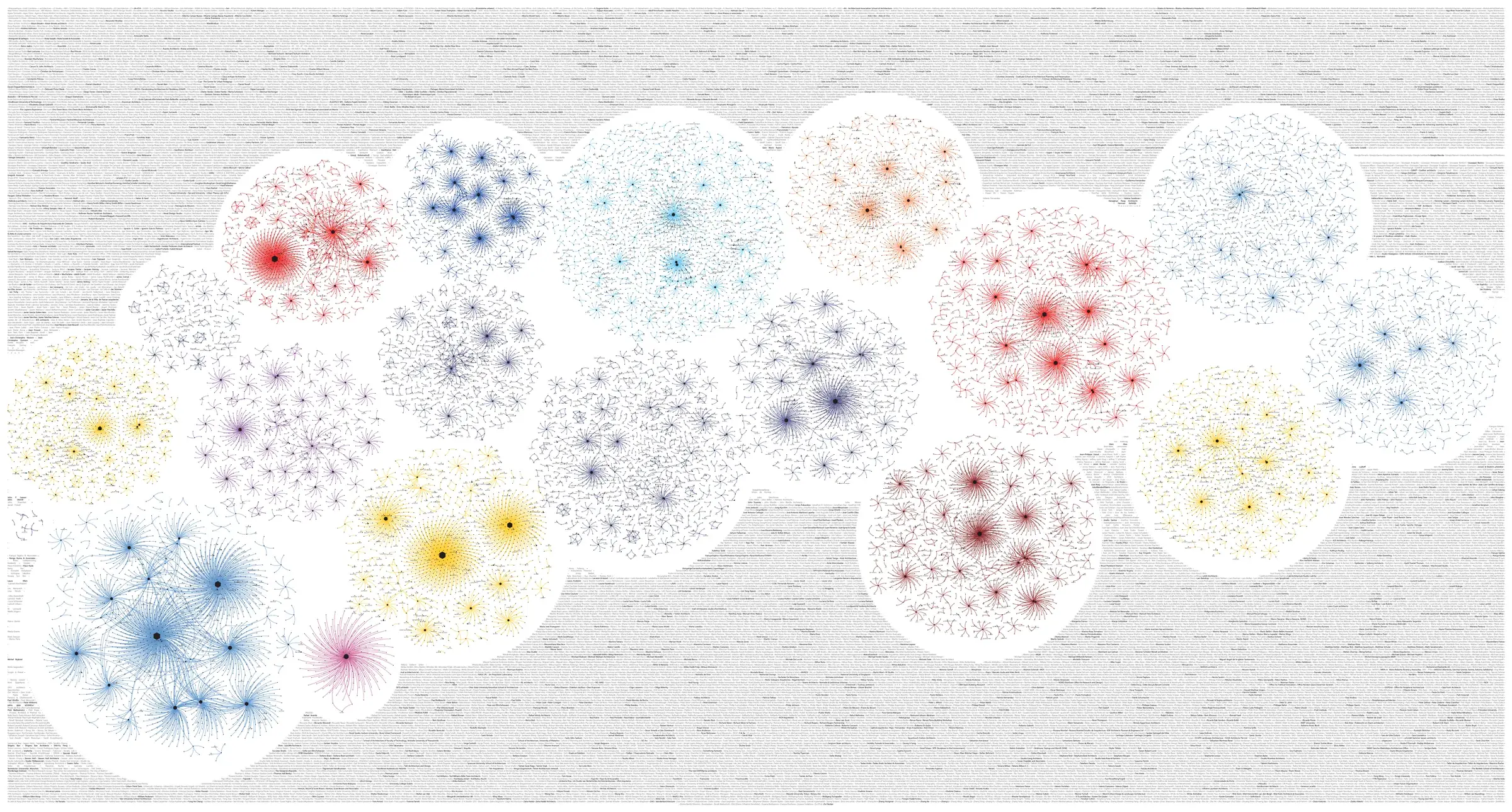
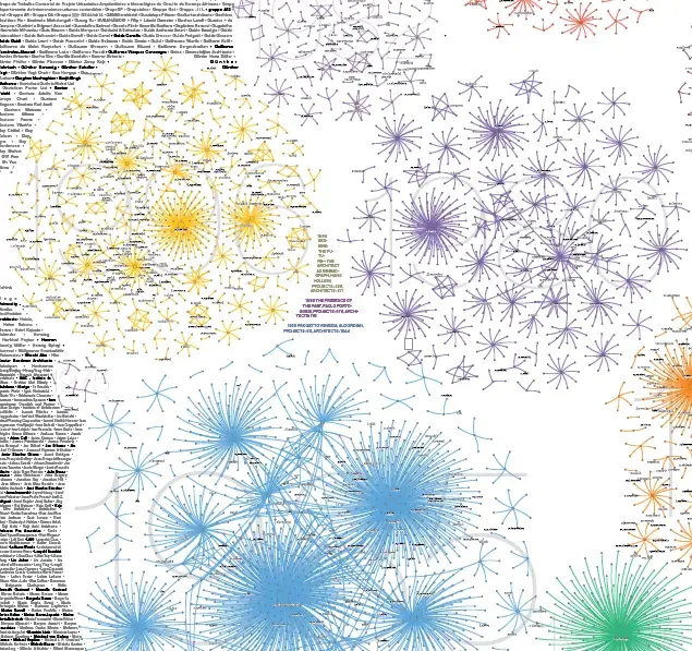
Wide print of coloured network circles over a grey field of names
Fig. 002.21
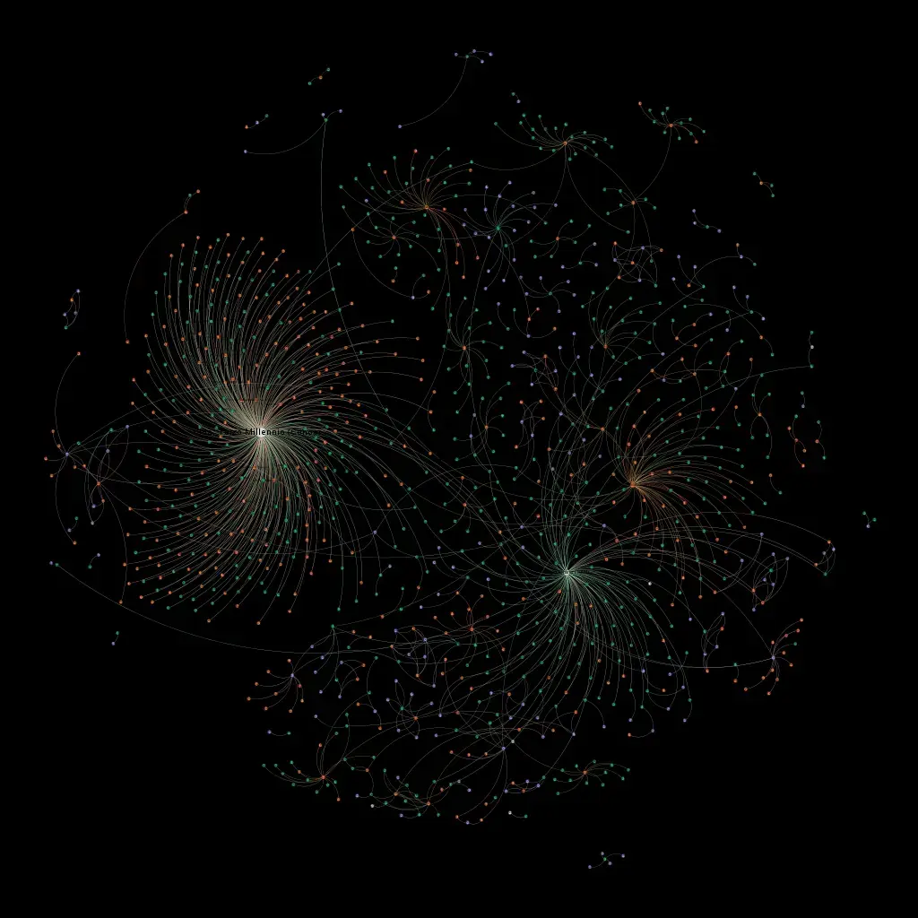
Network render in pale lines on black
Fig. 002.22
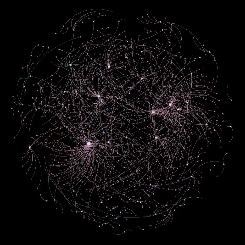
Network render in pale violet lines on black
Fig. 002.23
Close-up of network print with coloured circles and names
Fig. 002.24
Coloured network clusters over a field of names
Fig. 002.25
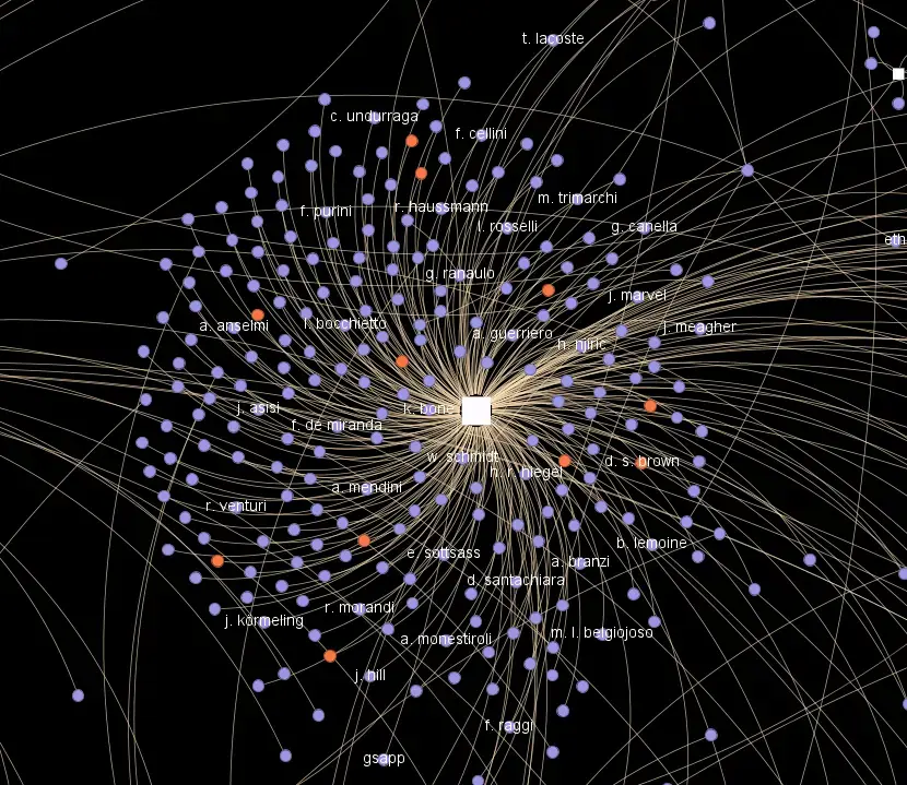
Network render on black, lines radiating from one white node
Fig. 002.26
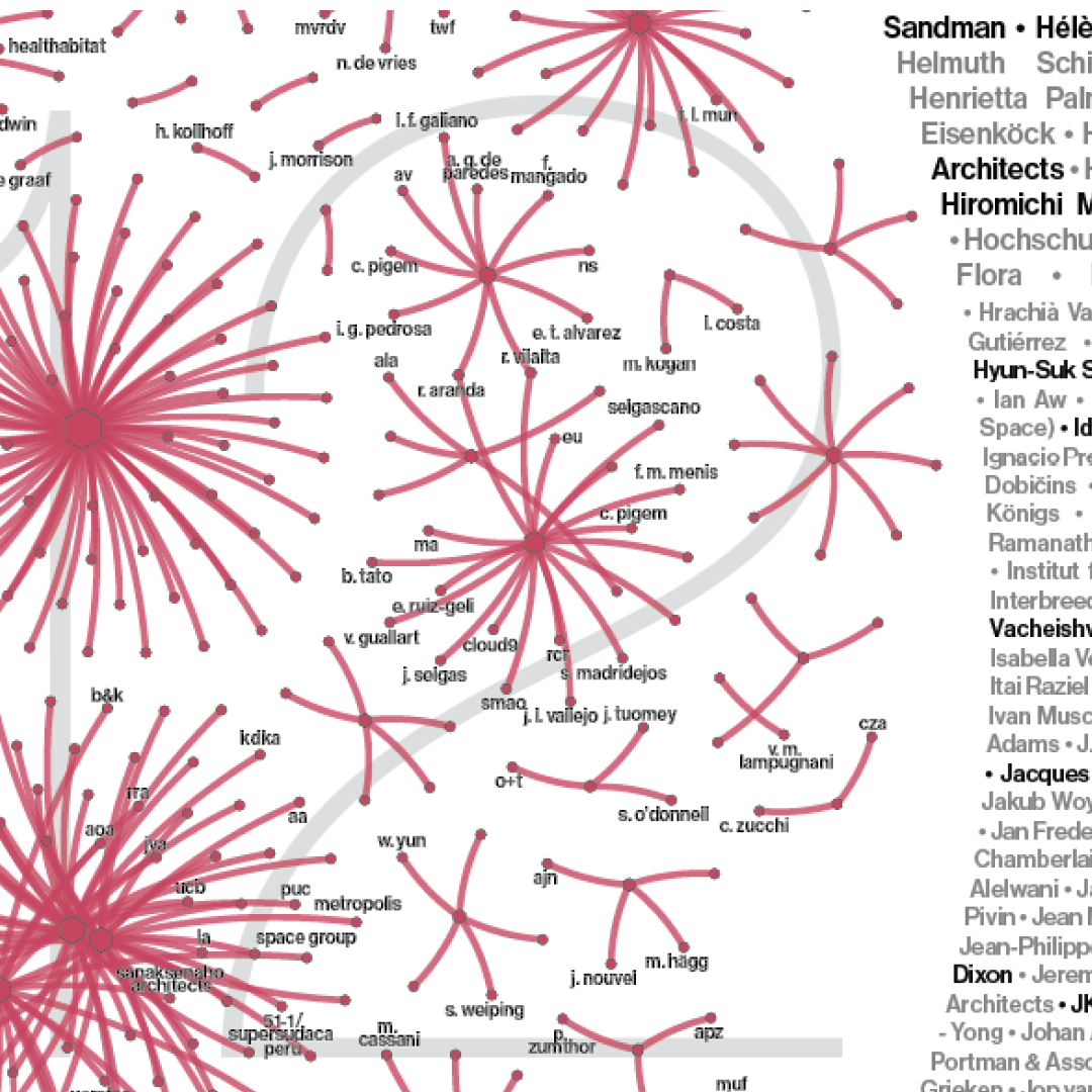
Detail of a red network with architects' names as labels
Fig. 002.27
Detail of a violet network with architects' names as labels
Fig. 002.28
Medium
Data art
Materials
Data, print
Dimensions
7 × 3 m
Tools
Adobe Illustrator, network visualization
Credits

Participants

Department of Architecture and Design – DAD, Politecnico di Torino
Michele Bonino (coordination)
Albena Yaneva
BarabasiLab, Northeastern University
Albert-László Barabási
Center for Design, Northeastern University
Paolo Ciuccarelli

Team

DAD, Politecnico di Torino: Edoardo Bruno, Valeria Federighi, Camilla Forina, Monica Naso (Architectural Design and Curatorial Coordination); Micol Rispoli (Ethnography of Architecture)
Alp Arda with Noha Lentz, Zhenyi Chai (Architectural Design and Curatorial Coordination)
BarabasiLab: Csaba Both, Alice Grishchenko, Daria Koshkina (Data Visualization and Network Science)
Ábel Elekes, Rodrigo Dorantes Gilardi, Yixuan Liu, Marco Buongiorno Nardelli (Data Analysis and Network Science)
Center for Design: Todd Linkner, Matthew Blanco, Lindsey Henriques (Information Design and Data Visualization)
University of Manchester: Benjamin Blackwell (Ethnography of Architecture)

Technical Collaborators

SABO Studio
Multimedia Lab, DAD, Politecnico di Torino (filming and editing Riccardo Covino and Pietro Merlo)
Geomatics for Cultural Heritage Lab, DAD PoliTo

Supporters

Fondazione Compagnia di San Paolo; Camera di Commercio di Torino; Department of Network and Data Science – Central European University; Politecnico di Torino; Northeastern University; SECAP S.p.A.; REPLY S.p.A.

003

Home Is Where

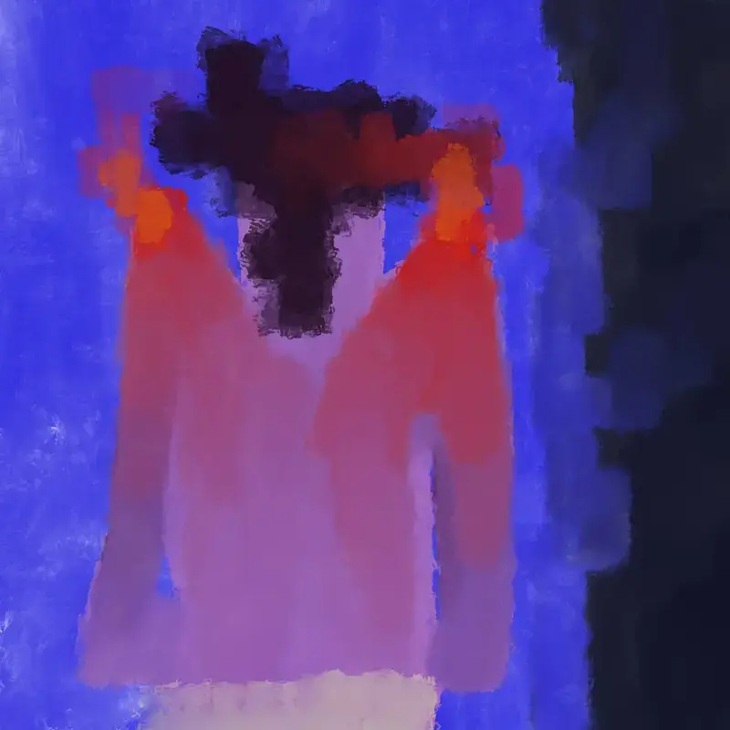
Glow Girl: digital painting of a pink figure against blue
Fig. 003.1 — Glow Girl
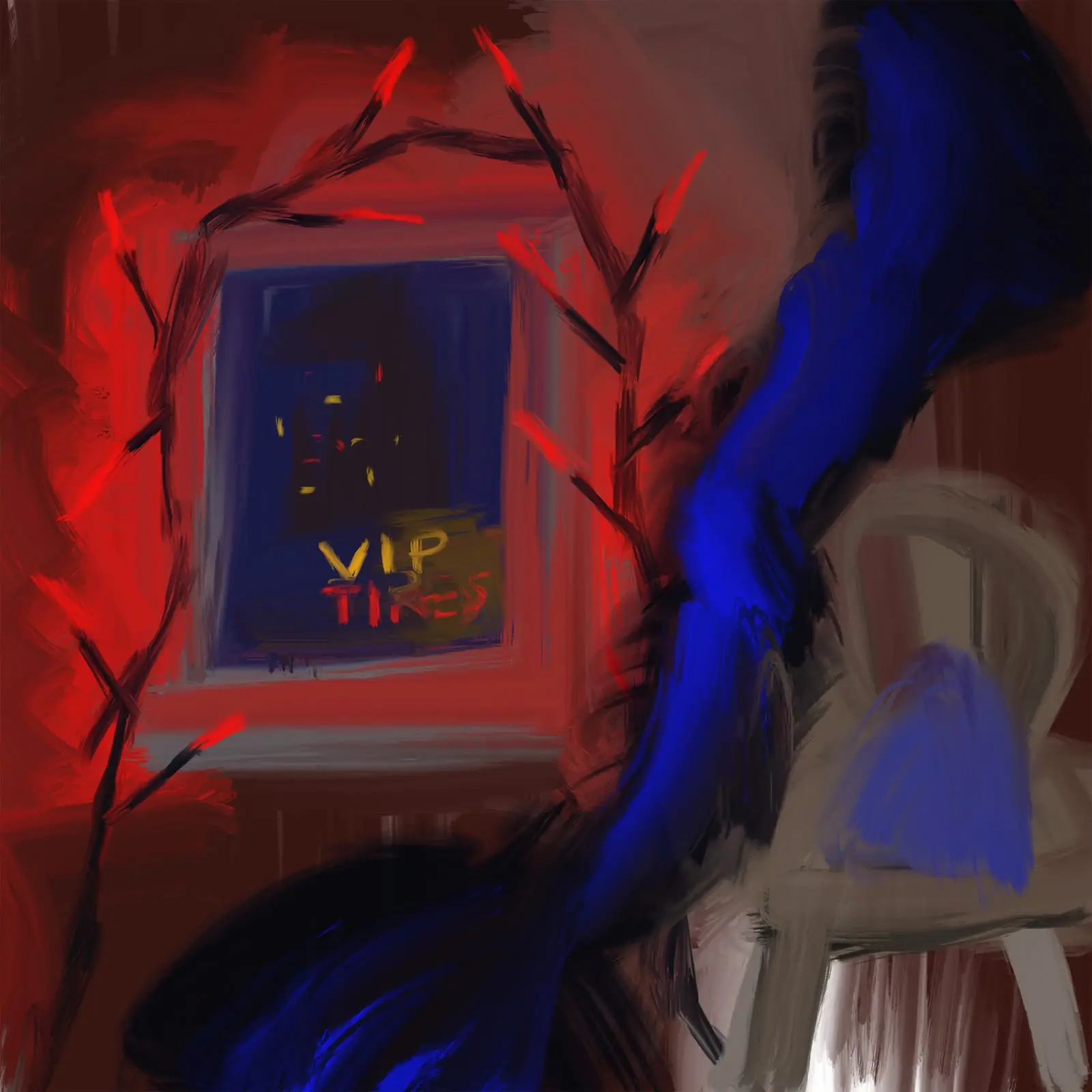
Home Is Where: digital painting of a window marked VIP beside a chair
Fig. 003.2 — Home Is Where
Medium
Digital art
Materials
Hahnemühle prints
Dimensions
  1. Glow Girl, 2024. Digital painting, unique Hahnemühle print, 11.8 × 11.8 in
  2. Home Is Where, 2024. Digital painting, unique Hahnemühle print, 11.8 × 11.8 in
  3. Postwoman, 2024. Digital painting, unique Hahnemühle print, 17 × 11.8 in
Tools
Custom digital brushes made by the artist from natural-texture research

The Story

‘Home Is Where’ project is about international women’s experiences through the lens of digital art, specifically to unveil how personal, emotional experiences contribute to the understanding of an immigration experience. I capture the emotional landscape of immigration, both from the metaphorical perspective and also by capturing familiar places.

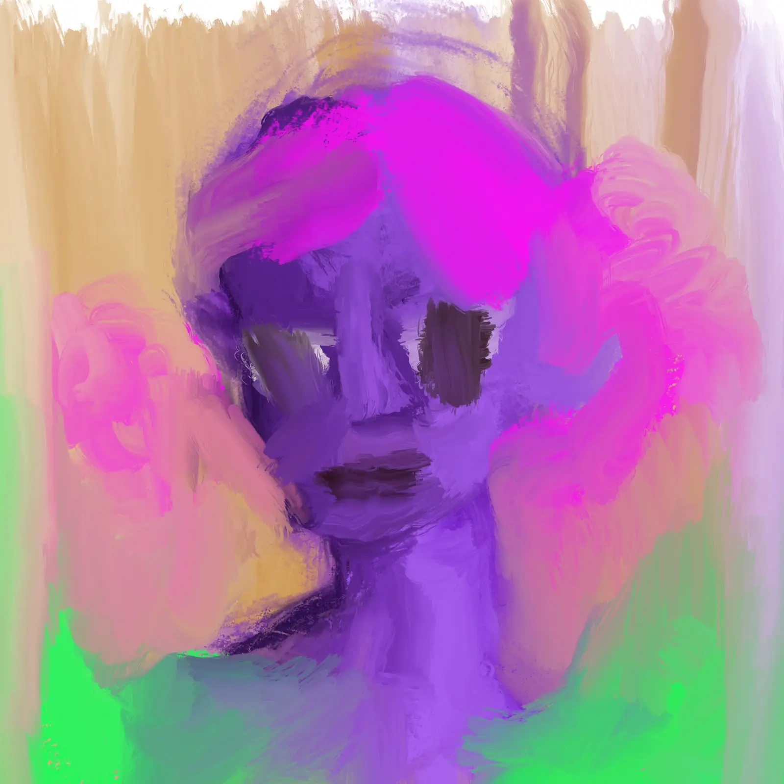
Digital painting of a purple face with pink hair
Fig. 003.3
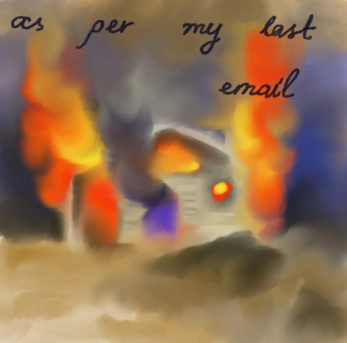
Amygdala: digital painting of a burning house with the words "as per my last email"
Fig. 003.4 — Amygdala
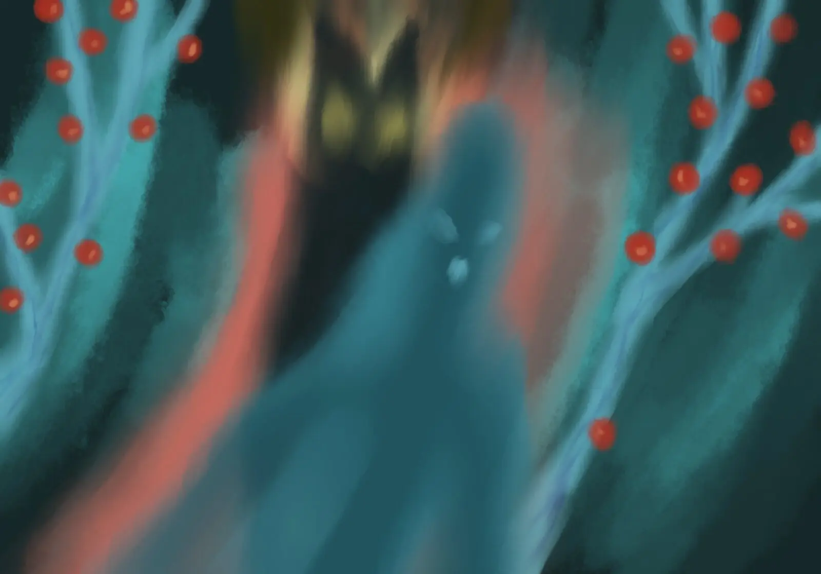
Postwoman: digital painting of a blurred blue figure between trees with red berries
Fig. 003.5 — Postwoman
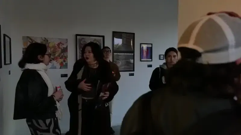
Exhibition opening: visitors in front of the Home Is Where prints
Fig. 003.6
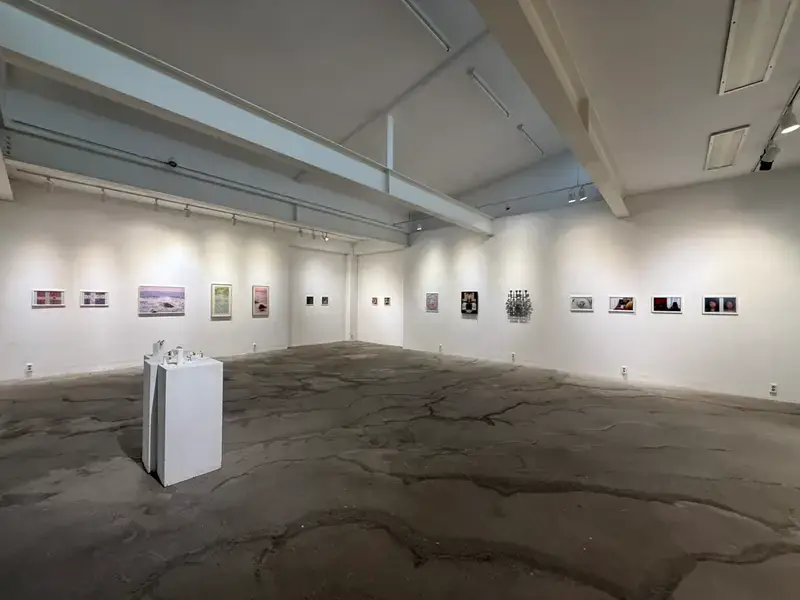
Gallery with the Home Is Where prints hung in a row
Fig. 003.7
004

Invisible Women

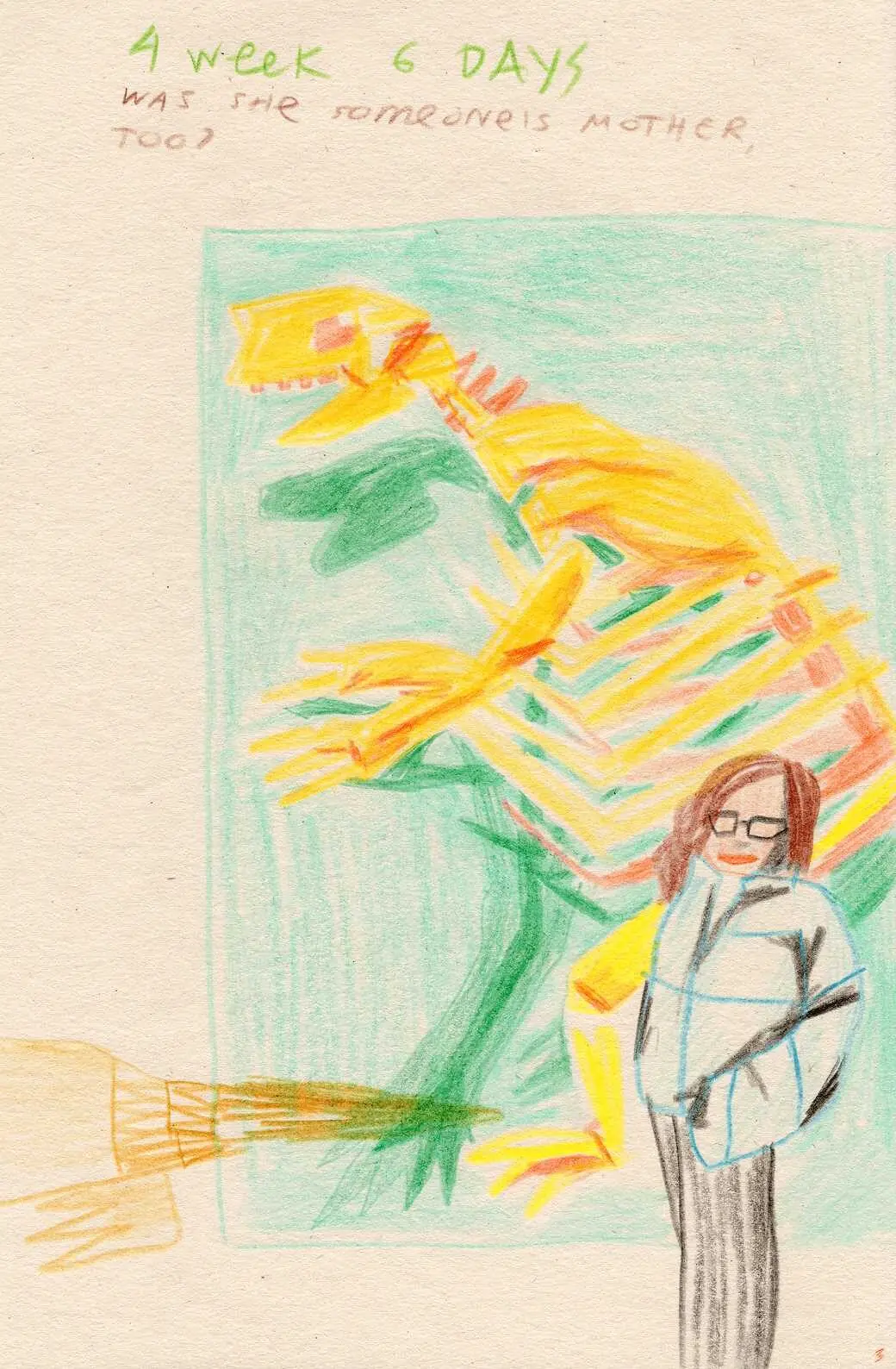
Diary page, week 4 day 6: a woman beside a dinosaur skeleton, "was she someone's mother too?"
Fig. 004.1
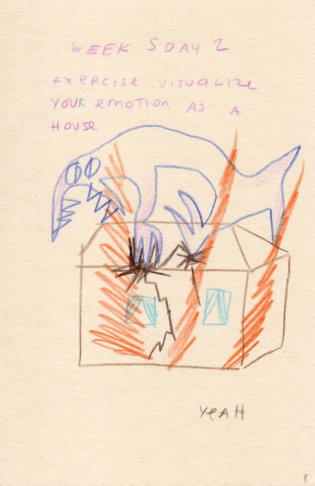
Diary page, week 5 day 2: a house drawn as an emotion
Fig. 004.2
Medium
Autobiographical comics
Materials
Paper
Dimensions
A5
Tools
Pencils

The Story

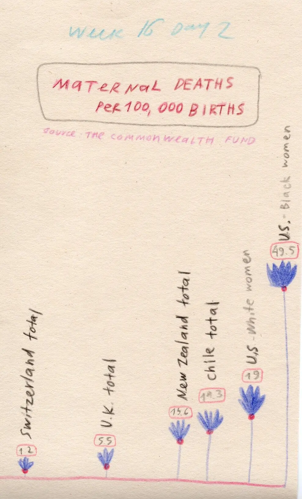
I was a data visualization researcher and artist in Boston when I became pregnant, so I did what I do: I started tracking. Both myself and the world. For example, I discovered that the United States has one of the highest maternal mortality rates in the developed world and that Black women face compounded risk. Then I found out (through experience) that regular taxi seatbelts are not designed for pregnant bodies and that 0 taxis have correct ones. Somewhere in Kenya, a woman in active labor is denied water.

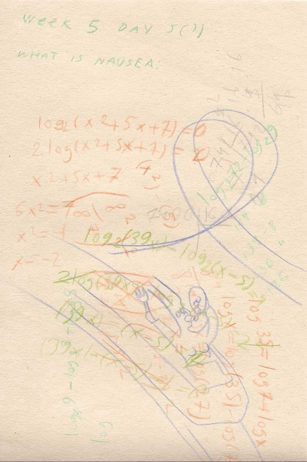
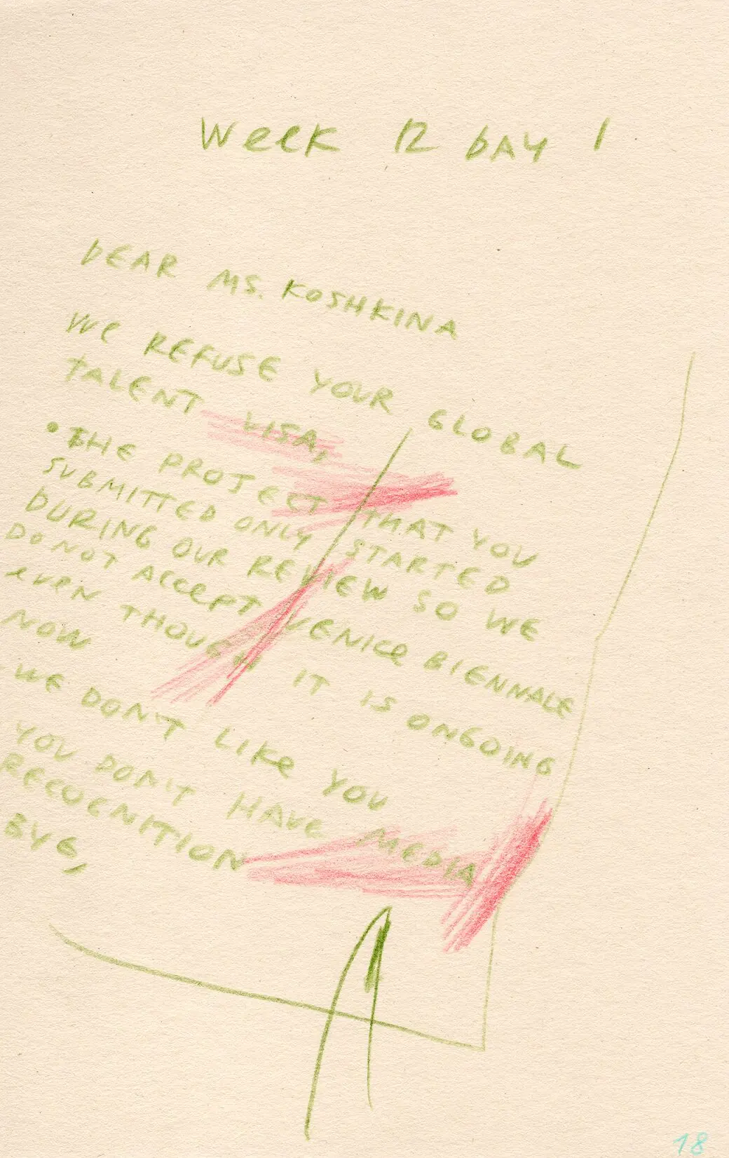
My approach to storytelling is ‘data + feelings’: I juxtapose ‘subjective’ and ‘objective’ information about pregnancy.

Diary page, week 5 day 5: equations and the question "what is nausea?"
Fig. 004.3
Diary page, week 12 day 1: a handwritten rejection letter
Fig. 004.4
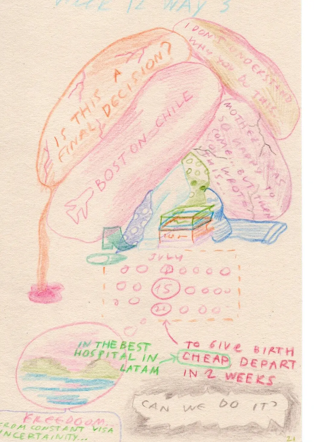
Diary page, week 12 day 3: a pregnant body with notes on giving birth abroad
Fig. 004.5
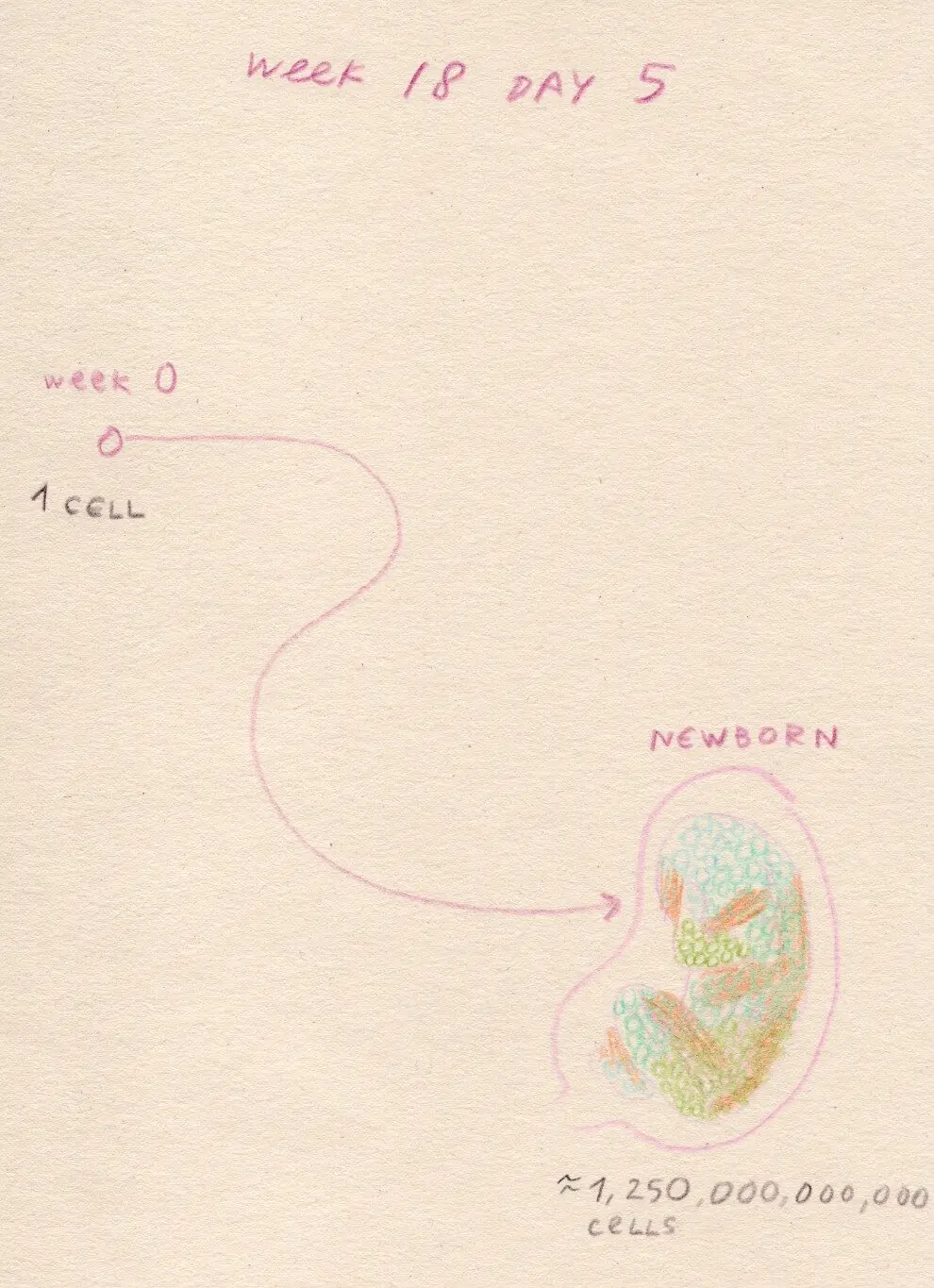
Diary page, week 18 day 5: a line from one cell to a newborn
Fig. 004.6
Diary page, week 16 day 2: chart of maternal deaths per 100,000 births by country
Fig. 004.7
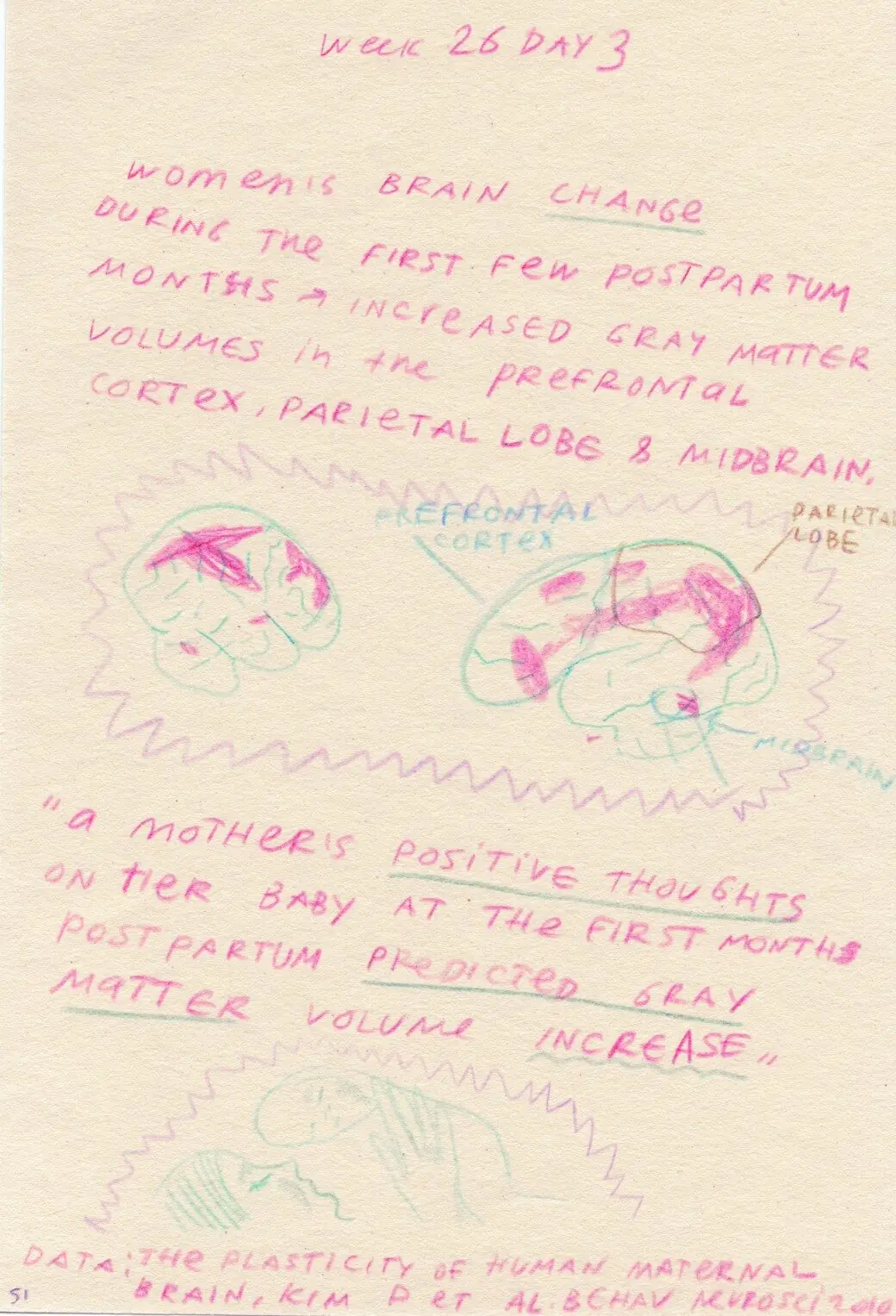
Diary page, week 26 day 3: notes and drawings on how a mother's brain changes
Fig. 004.8
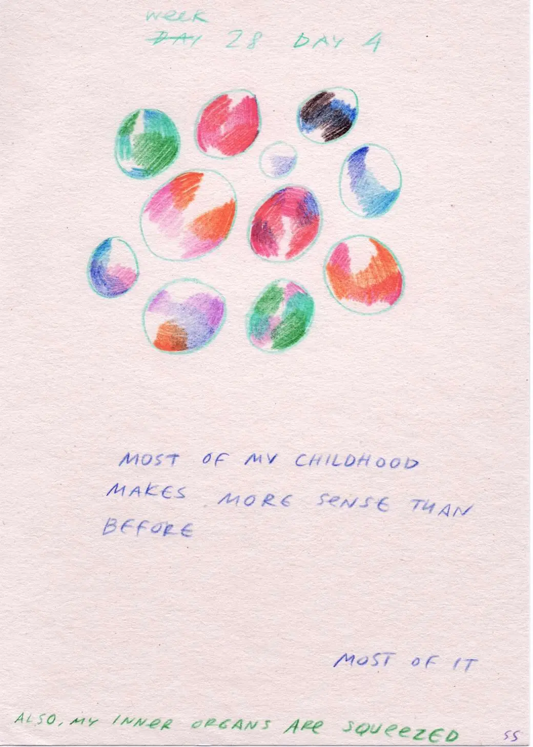
Diary page, week 28 day 4: coloured circles, "most of my childhood makes more sense than before"
Fig. 004.9
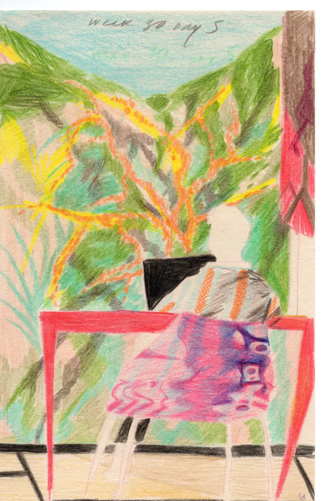
Diary page, week 30-something: a woman at a table by a window with plants
Fig. 004.10
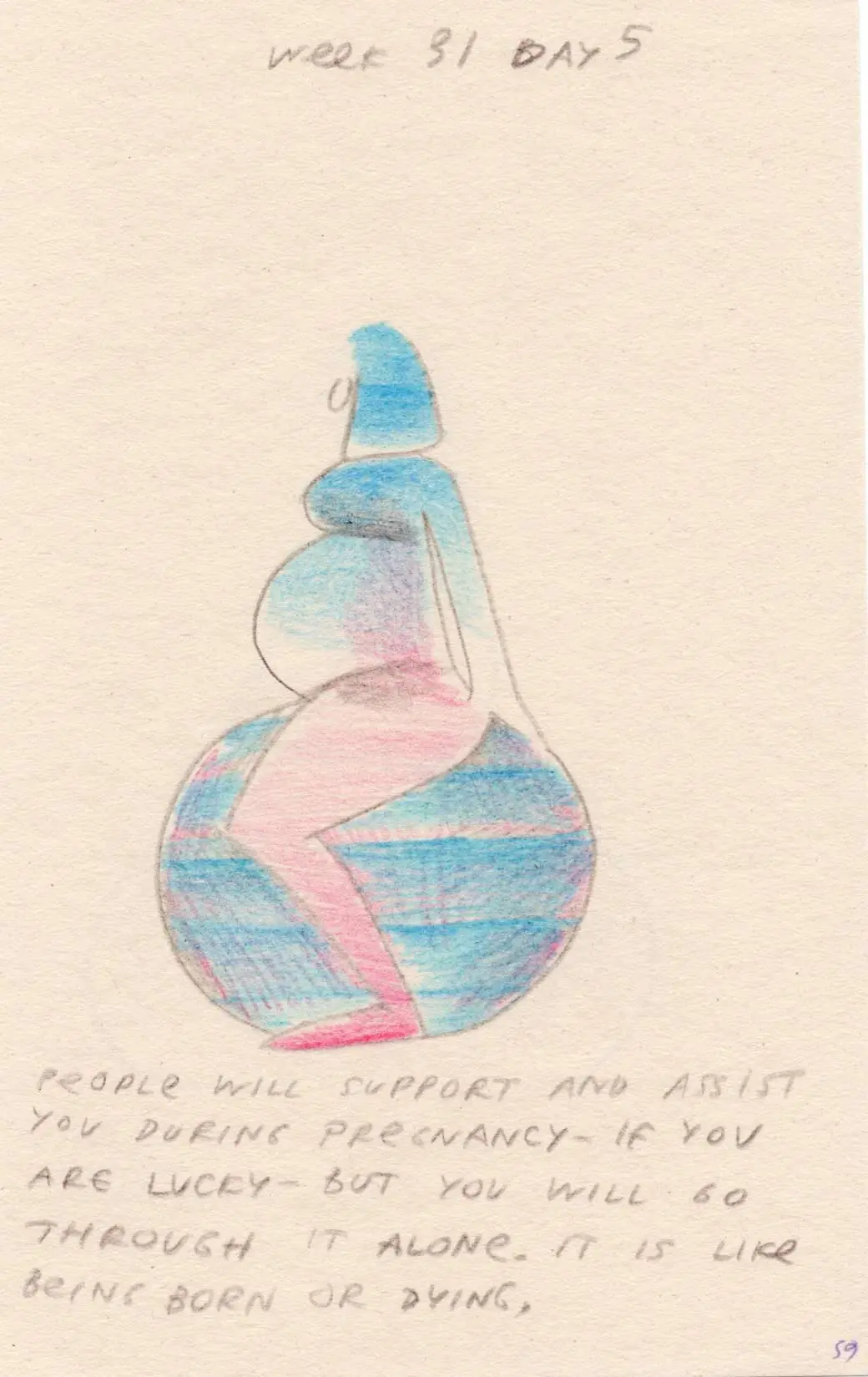
Diary page, week 31 day 5: a pregnant figure balancing on a globe
Fig. 004.11
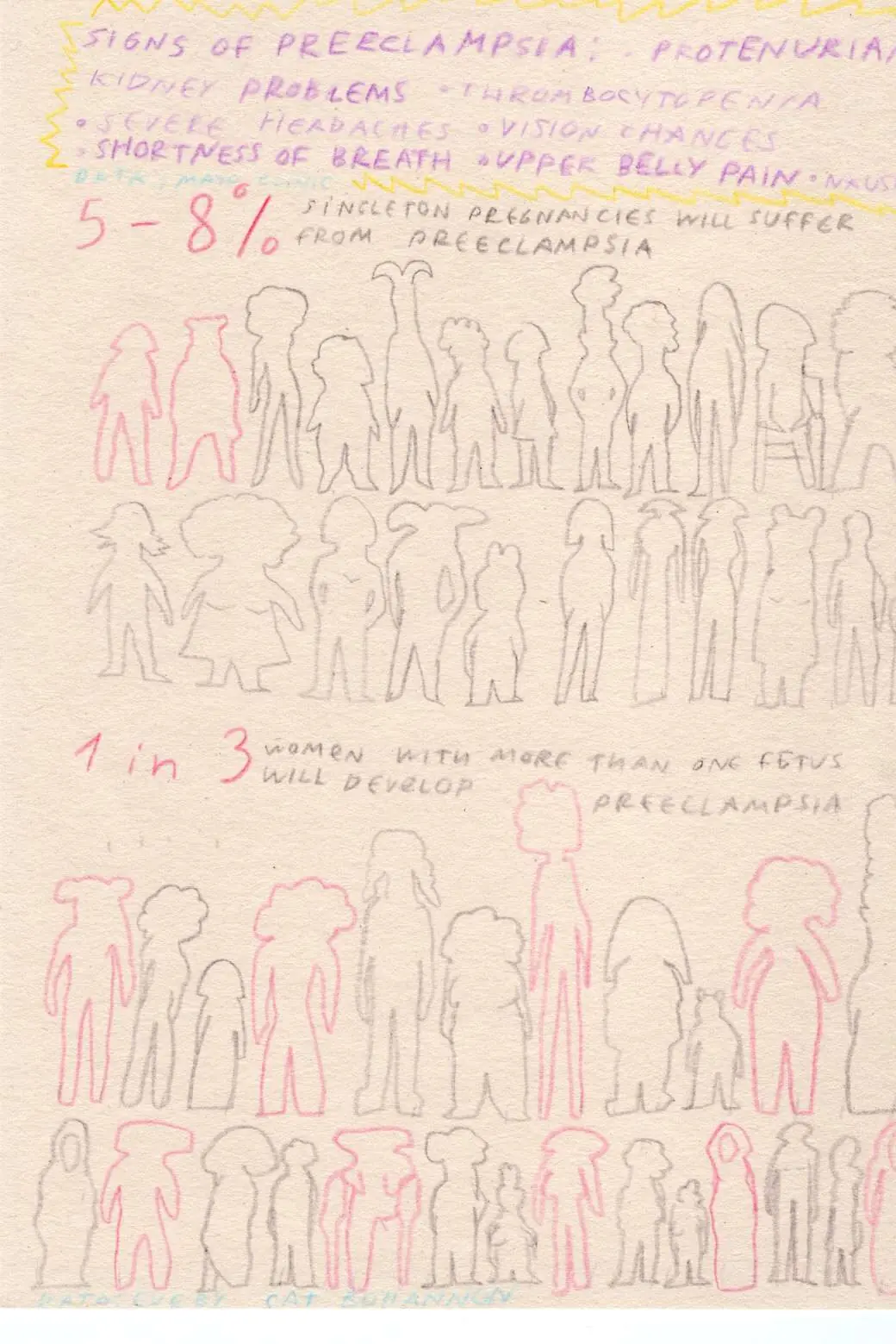
Diary page on preeclampsia: rows of women's silhouettes, one in three highlighted
Fig. 004.12